6 inspiring data visualization examples to brighten your week
Data has always been an important part of business strategy, as it helps companies understand their audience and track the progress of their products. In today’s digital age, nearly every company across all industries relies heavily on data to make informed decisions. At Rokt, we understand the value of data-driven insights and aim to share this sentiment with our own partners.
The way data is being used to inform business decisions has grown astronomically since the early 2000s. Data is essential to tell a story to give decision makers the ability to make informed actions. Because of this, data visualization, or “vizzes,” have become a popular way to communicate complex data sets in a clear and visually appealing way. These vizzes often use design elements and interactive features to bring the data to life and make it easier to understand. Here are some examples of creative and inspiring data visualizations that effectively communicate the data:
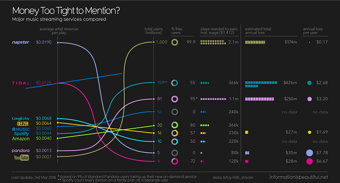
Example #1 – The data is easy to understand.
When presenting data in the form of a vizze, it should be easily comprehensible to its audience.This data vizze presents the top-line stats of popular music streaming services using numbers and graphs, and includes color coding to differentiate between each service.
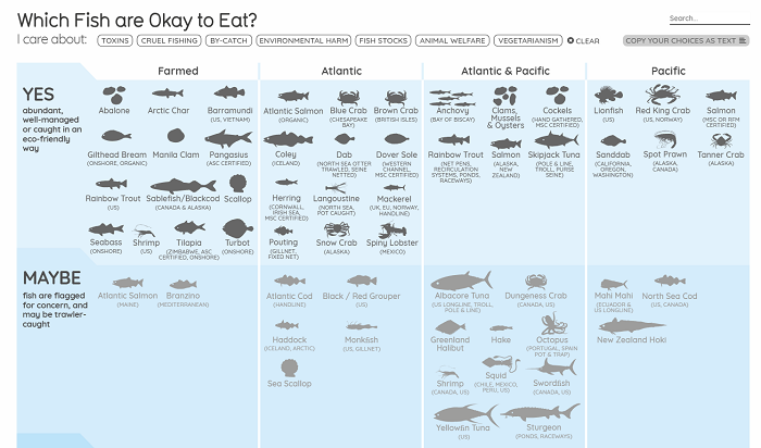
Example #2 – Uses data subject as a design element.
Data can often be quite dense, so why not make it more fun? This graph utilizes the subject of the data set, what types of fish are okay to eat, as a design element. Each type of fish and crustacean is clearly defined which helps to inform viewers, including this analyst, as to what each type of underwater critter actually looks like.
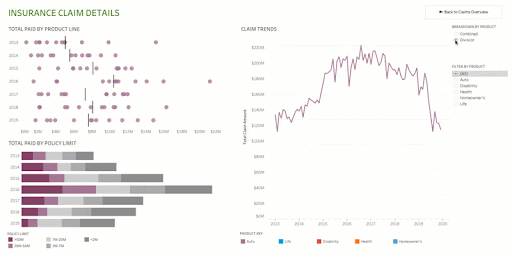
Example #3 – Employs animation.
Animation can add excitement and bring data to life. This map from Tableu illustrates insurance by claim and how they have changed over time.
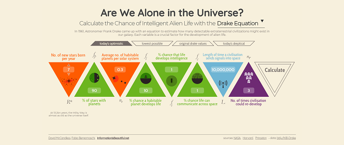
Example #4 – The data is interesting.
Data can reveal new and fascinating information. This data vizze uses the Drake Equation to estimate the number of extraterrestrial civilizations that may exist in our galaxy. It even includes tip cards to guide users through the data.
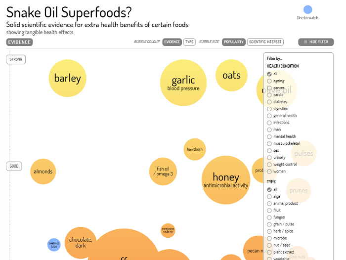
Example #5 – User interaction is included.
This snake oil superfoods data vizze invites users to interact with the data by changing the bubble colors, adjusting bubble size, and filtering through the information. Users can also learn more about each superfood by hovering over it.
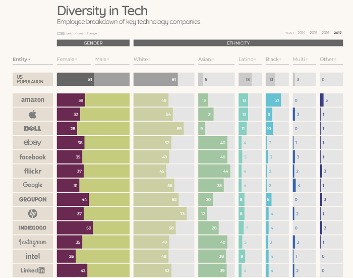
Example #6 – The data tells a story.
With all the numbers and persona clusters, it can be easy to forget that data can tell a story and data visualization allows us to illustrate it.This vizze focuses on diversity – or lack thereof – in the tech industry, as well as in the U.S. population, Fortune 500 CEOs, and U.S. Congress.